Facebook Profile

Overview
From streamlining the editing flow to designing the vision of profile, I focused on making profile easier to update and more engaging while balancing simplicity and scale.
Impact
We are currently rolling out the redesigned experience to users worldwide. You can learn more about the product update in the official Facebook release here.
Editing
Problem
Profiles sit untouched, leadng to decreased engagement and friending. Users are confused about multiple ways and different UI patterns to edit profile on both Details and About page. They missed out more entities to edit such as life events, contact, gender, etc. because About is a superset of Details.

Solution
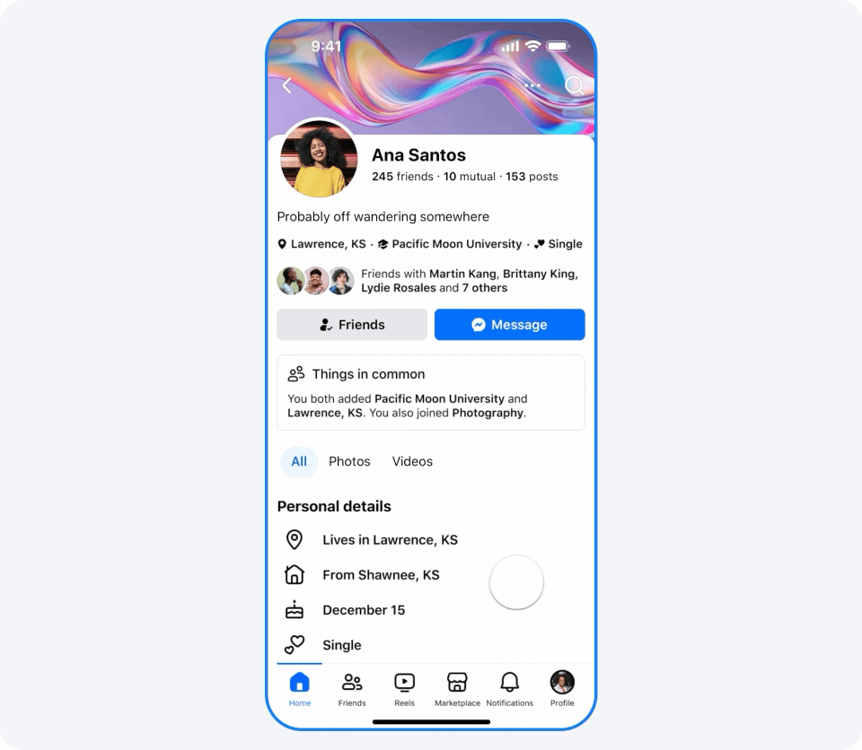
Consolidated Details and About pages into one streamlined page, eliminating the need to switch between multiple detail pages. Key information from the previous details page was converted into a pinned section with inline actions, allowing quick edits without disrupting the main workflow.
This design reduces clicks and navigation, enhances clarity by keeping all edits visible in context, and improves overall efficiency and accessibility.

Presentation
Problem
Viewers expect profiles to offer a quick sense of realness and a ‘vibe check’ into what an author is into, however, profile mainly shows factual information. A large number of DAU haven’t updated in a year suggests profiles are viewed as static with less value in updating.


Process
Explored ways to make the profile more expressive and showing interests.

After conducting user research, I discovered that some of the original concepts felt too experimental and were not intuitive for older adult users.
To address this, I developed a new vision:
Move key details to the top introduction card for greater visibility.
Enhance interactivity between viewers and profile owners by using chips.
Introduce an "About" tab to improve the discoverability of profile information.
Prioritize interest fields such as music and groups.

Strategy of validating diff directions
1. move the header to the top
2. Visual forms of the header: H-scroll cards, chips, and text-only
Final version
With guidance from leadership, the Profile team prioritized the "profile as a directory" use case and developed a comprehensive redesign.
This updated experience enables people to connect on a deeper level—discovering not only where others work and live, but also what TV shows they’re watching, which albums they have on repeat, their hobbies, travel experiences, and more.